Color Psychology in Interior Design: How Colors Affect Your Mood

Colors have a profound impact on our emotions, behavior, and well-being. In interior design, understanding color psychology helps you create spaces that not only look beautiful but also support your desired mood and activities. This guide explores how different colors affect us and how to use this knowledge, along with AI tools, to create spaces that truly enhance your life.
Understanding Color Psychology
Color psychology is the study of how colors affect human behavior and emotions. While individual responses to color can vary based on personal experiences and cultural background, research has identified general patterns in how colors affect mood, energy levels, and even physiological responses.
In interior design, this knowledge becomes powerful. You can choose colors that promote relaxation in bedrooms, energy in home offices, and appetite in kitchens. Understanding color psychology helps you make intentional design choices that support your lifestyle.
How Different Colors Affect Mood
Blue: Calm and Focus
Blue is associated with calmness, tranquility, and focus. It can lower heart rate and blood pressure, making it ideal for bedrooms and spaces where you want to relax. Lighter blues feel airy and peaceful, while deeper blues can feel more sophisticated and stable.
However, too much blue can feel cold or depressing. Balance it with warm accents or use it in rooms with plenty of natural light.
Green: Balance and Harmony
Green represents nature, balance, and harmony. It's restful for the eyes and promotes feelings of calm and renewal. Green works well in almost any room, from bedrooms to living spaces, as it creates a sense of balance and connection to nature.
Different shades of green have different effects: sage green is calming, emerald green is luxurious, and mint green is fresh and energizing.
Yellow: Energy and Optimism
Yellow is associated with happiness, energy, and optimism. It can stimulate mental activity and create a cheerful atmosphere. However, bright yellow can be overwhelming and even cause anxiety in some people.
Use yellow strategically—as accents, in well-lit spaces, or in softer, muted tones. It works well in kitchens, entryways, and spaces where you want to create energy.
Red: Passion and Energy
Red is powerful and stimulating. It can increase heart rate and create feelings of passion, energy, and excitement. Red is often used in dining rooms as it can stimulate appetite and conversation.
Because red is so intense, use it carefully. Consider it for accent walls, accessories, or in rooms where you want to create energy and warmth. Avoid it in bedrooms where you want to relax.
Orange: Warmth and Creativity
Orange combines the energy of red with the cheerfulness of yellow. It promotes creativity, enthusiasm, and social interaction. Orange works well in creative spaces, playrooms, and areas where you want to encourage conversation.
Like red, orange is intense, so use it strategically. Softer, more muted oranges (like terracotta) are easier to live with than bright orange.
Purple: Luxury and Creativity
Purple is associated with luxury, creativity, and spirituality. Lighter purples (lavender) are calming and restful, while deeper purples feel more luxurious and sophisticated.
Purple works well in bedrooms, creative spaces, and areas where you want to add a touch of luxury. It pairs beautifully with neutrals and metallics.
Neutrals: Calm and Versatility
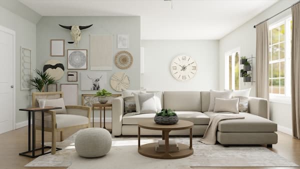
Neutrals—whites, grays, beiges, and taupes—create calm, versatile backgrounds. They don't stimulate strong emotional responses, making them ideal for creating peaceful, flexible spaces. Neutrals allow other elements (furniture, art, accessories) to take center stage.
However, too many neutrals can feel sterile or boring. Add color through accents, artwork, and textiles to create interest and personality.
Applying Color Psychology by Room
Bedrooms
Bedrooms benefit from calming colors that promote rest. Blues, greens, soft purples, and warm neutrals work well. Avoid bright, energizing colors like bright red or yellow, which can interfere with sleep.
Home Offices
Offices need colors that promote focus and productivity. Blues and greens are excellent choices, as they promote concentration. Avoid overly stimulating colors that can cause distraction.
Living Rooms
Living rooms can be more flexible. Consider the mood you want to create—warm, inviting colors for social spaces, or calm, neutral tones for relaxation. Many people choose neutrals as a base and add color through accessories.
Kitchens
Kitchens benefit from colors that stimulate appetite and create energy. Warm colors like red, orange, and yellow work well, but in moderation. Many modern kitchens use white or neutral bases with colorful accents.
How AI Helps with Color Selection
Visualizing Color in Your Space
One of the biggest challenges in choosing colors is imagining how they'll look in your actual space. AI design tools can show you exactly how different colors appear in your room, accounting for lighting conditions and existing elements.
Color Harmony
AI can suggest color combinations that work harmoniously together, ensuring your color choices create the desired mood while maintaining visual balance. The AI understands color theory and can suggest palettes that are both psychologically effective and aesthetically pleasing.
Testing Different Moods
With AI, you can quickly test how different color schemes affect the feel of your space. Want to see how your bedroom would feel in calming blue versus energizing yellow? AI shows you instantly, helping you make informed decisions about which colors support your goals.
Choose Colors with Confidence Using Decory AI
Selecting colors that create the right mood for your space is easier with AI. Decory AI can help you visualize how different colors look in your actual room, suggest harmonious color combinations, and help you understand how colors will affect the atmosphere.
Upload a photo of your space, experiment with different color palettes, and see how they transform the mood and feel of your room. AI helps you make color choices that are both beautiful and psychologically effective. Try Decory AI today and discover the power of color psychology in your home.
Color Psychology Tips
- Consider the room's purpose: Choose colors that support the activities that happen in each space
- Think about natural light: Colors look different in north-facing rooms versus south-facing rooms. AI can help account for this
- Start with neutrals: Use neutrals as a base and add color through accents, making it easier to change moods over time
- Consider personal associations: While general color psychology is useful, your personal associations with colors matter too
- Test before committing: Use AI to visualize colors before painting, ensuring you're happy with the psychological impact
Conclusion
Color psychology is a powerful tool in interior design, allowing you to create spaces that not only look beautiful but also support your desired mood and activities. By understanding how different colors affect emotions and behavior, and using AI tools to visualize and test color choices, you can make informed decisions that enhance your well-being. Remember that while color psychology provides valuable guidance, your personal preferences and the specific context of your space are equally important. Use color intentionally to create a home that truly supports how you want to live and feel.

