Can't Decide on a Paint Color? Let AI Design Your Room First
What this article answers: AI room color design lets you upload a photo of your room and see any paint color rendered photorealistically on your walls — accounting for your specific lighting, floor tones, and furniture — before you buy a single tin. It solves the three core reasons paint decisions go wrong: scale distortion, metamerism under different lights, and the inability to see color in context. Free tools exist. The whole process takes under 30 seconds per variation.
You've done everything right. You ordered the sample pots. You painted little rectangles on the wall — four of them, next to the window. You've stared at them over three different days and in six different lighting conditions, and you still don't know.
So you pick one. Paint the room. And realise within 48 hours that you chose wrong. The colour that looked calm and collected in that small test square has taken over the four walls in a way that feels nothing like you imagined.
This is the single most common renovation regret among homeowners and DIY decorators in 2026 — and there's a smarter way to approach it.
What Is AI Room Color Design?
AI room color design is a photo-based visualisation tool that applies paint color options to a real photograph of your room and renders a photorealistic result — accounting for your actual lighting, furniture, floor tones, and spatial proportions — in under 30 seconds. Unlike digital color overlays or basic filter tools, it uses spatial mapping and physically-based rendering to simulate how a specific paint color will actually behave on your walls.
The critical difference from sample pots: AI shows you the color at full scale, in your actual room, under your actual light conditions, next to your actual furniture — simultaneously.
Why Choosing Paint Color Is Genuinely Difficult
Most homeowners assume they're the problem. They're not. The problem is structural — three distinct phenomena make paint color decisions unreliable when using traditional methods.
The Scale Effect
Color behaves differently when it fills a large surface than it does on a small sample. Saturated colors intensify dramatically at scale. Mid-tones that seemed interesting often go flat across four walls. Dark colors either deepen a space beautifully or close it off entirely. A 6-inch test square cannot simulate four walls. It's not a judgment problem; it's a physics problem.
Metamerism: Why Colors Shift Under Different Lights
Metamerism is the phenomenon where a color changes appearance under different light sources. A taupe that reads as a sophisticated warm neutral under natural daylight can shift to beige-pink under warm incandescent bulbs, or muddy grey-green under cool LED lighting.
This matters particularly in:
- North-facing UK rooms that rely heavily on artificial light
- Australian homes with intense natural sunlight that bleaches color
- US open-plan spaces where a wall catches multiple light sources simultaneously
The Relationship Problem
Paint color does not exist on its own. It enters a relationship with your floor tone, your furniture, your ceiling color, your architectural trim, and the quality of light in your specific room. A warm greige that looks beautiful against white card in a paint shop reads completely differently against warm oak floors than it does against cool grey tiles. Traditional sampling can't show you these relationships. AI can.
How an AI Paint Color Picker for Rooms Works
An AI paint color picker for rooms is a tool that performs three simultaneous operations on your uploaded room photo: spatial mapping (identifying walls, floors, windows, and furniture), lighting simulation (modeling how light falls and bounces in your specific room), and color rendering (applying the selected paint color with accurate depth, shadow, and material-surface interaction).
How the technology works, step by step:
- Spatial analysis — the AI maps your room's three-dimensional geometry, locating where walls meet, where light enters, and how shadows fall
- Material recognition — identifies floor texture, furniture surfaces, and trim materials to understand how surrounding elements will interact with the new wall color
- Physically-based rendering — applies the paint color with light-bounce simulation, rendering it differently on a sun-lit wall versus a shaded corner
- Full-room output — generates the result in the context of your entire room, not in isolation
Modern AI room color tools achieve 96–99% spatial accuracy from a well-taken room photograph.
How AI Interior Color Scheme Tools Handle Lighting
AI interior color scheme tools that work from a real room photograph capture your room's actual lighting conditions — not a generic daylight simulation — and render new wall colors within that specific light environment. This is the most practically important thing AI color tools do.
Why your room's orientation matters:
- A north-facing bedroom in Edinburgh receives cool, indirect light for most of the day — warm whites with yellow undertones almost always perform better than cool whites
- A south-facing living room in Brisbane receives intense direct sun for hours — lighter, chalky finishes resist bleaching better than saturated colours
- A US open-plan space where a wall catches morning sun from one direction and reflected light from another needs testing under both conditions
Practical tip — the three-photo method: Photograph your room three times: morning, midday, and with evening lighting active. Run your top color candidates through AI on each photo.
Room Color AI Generator: Step-by-Step Process
A room color AI generator is a tool that takes a room photograph and produces a photorealistic visualization of that room with a different paint color applied.
- Photograph your room correctly — Stand in the doorway or far corner. Shoot level, in natural daylight, camera neither angled up nor down.
- Upload to an AI color design tool and select a color family — Before committing to a specific shade, test color directions first.
- Test your top colors in different lighting conditions — Use the three-photo method above.
- Evaluate color in relationship to your fixed elements — Don't evaluate the wall color in isolation.
- Compare at least five variations before deciding — AI generation is instant.
- Extract a specific color reference from the AI output — Walk into the paint shop knowing exactly what you're looking for.
Color by Room: How AI Handles Each Space
What Makes Living Room Color Different?
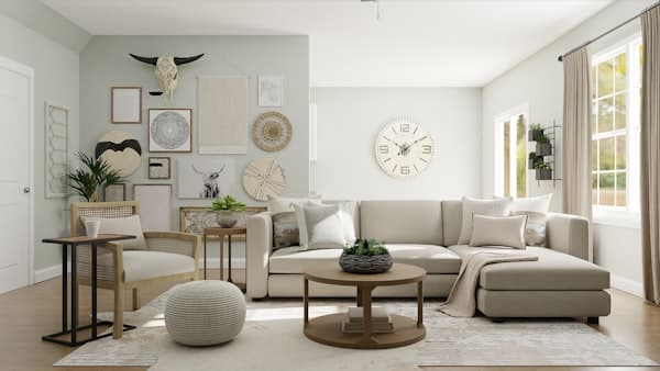
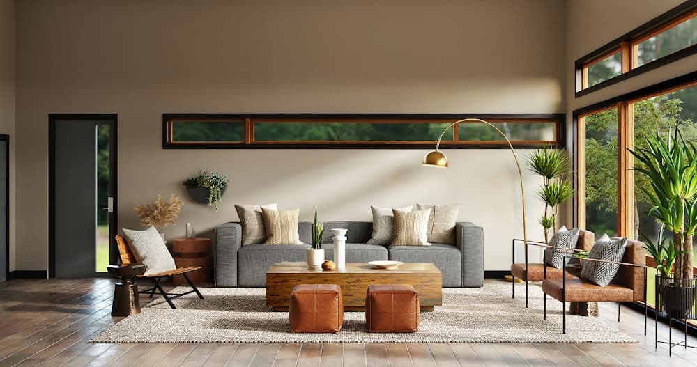
Living room color decisions are the most complex because the living room is the most visually layered space in the home. Sofas, rugs, curtains, artwork, wood tones, and natural light all exist in the same visual field. AI shows the proposed color in relationship to all existing elements at once.
2026 living room color trends by market:
- US: Dusty sage, warm terracotta, and soft clay tones are leading; warm greige remains the safest commercial choice
- UK: Deep forest green, inky navy, and dusty plum on feature walls; warm off-white for all-over treatment
- Australia: Chalky whites, raw ochre, and sandstone tones reflecting the landscape
Bedroom Color: Where Psychology Matters Most
Bedroom color directly affects sleep quality and morning alertness. Research on color psychology consistently shows that cooler, lower-saturation tones (pale blue, soft sage, dusty lavender, warm white) support rest better than warm-dominant or saturated shades. AI is particularly useful for bedrooms because bedrooms often have limited natural light.
Small Apartments and Open-Plan Spaces
In a small apartment, color decisions amplify every other design choice. A color that reads as measured in a 20×15ft room can feel overwhelming in a 350 sq ft studio. Open-plan spaces present a specific challenge: color zones need to transition coherently without hard visual breaks. AI can test the same color across multiple connected zones simultaneously.
US, UK, and Australia: Why Light Conditions Change Everything
Paint color decisions are location-specific. The same shade will read differently under Sydney's intense southern hemisphere sunlight, London's grey northern European light, and a US home's mixed lighting conditions.
United States — Larger windows, higher ceilings in newer builds, and the prevalence of open-plan living areas mean US color decisions often affect multiple zones simultaneously. Warm neutrals remain the dominant commercial choice, with sage greens, dusty blues, and terracotta trending strongly in 2026.
United Kingdom — British homes deal with less natural light. Warm whites with yellow undertones reliably outperform cool whites in most UK rooms. Deep feature wall colors are increasingly popular.
Australia — Australia's intense natural light combined with the prevalence of open indoor-outdoor living creates a specific challenge: colors can bleach under direct sun. Soft, chalky finishes and cooler, lighter tones tend to perform best.
Common Mistakes When Choosing Paint Color
1. Testing in the paint shop under fluorescent lighting — Paint shop lighting is optimized to display product, not to simulate your home's conditions.
2. Choosing based on the sample pot alone — A 3-inch square tells you almost nothing about how that shade behaves at scale.
3. Evaluating wall color without considering floors and furniture — Paint colors don't exist in isolation.
4. Making decisions under artificial light only — Use the three-photo method.
5. Choosing a trending color without checking your room's fixed elements — A trending color might not work in your specific room.
6. Committing after one or two tests — AI generation is instant.
The Real Cost of Getting Paint Wrong
Repainting a mistake is not just a cost in materials. It's a cost in time, disruption, and the psychological weight of living with something you know is wrong. In UK and Australian homes, repainting a medium-sized room typically costs £150–£400 in materials alone. In the US, comparable costs run $150–$400 per room. The cost of using AI to test color before committing? Free to start.
FAQ: AI Room Color Design
What is AI room color design?
AI room color design is a photo-based tool that applies paint color options to a photograph of your actual room and renders a photorealistic result showing exactly how any shade will look on your walls.
How does an AI paint color picker for rooms work?
It performs spatial mapping, lighting simulation, and color rendering with physically-based accuracy. The result shows how a selected paint color will actually appear on your walls.
How accurate is an AI room color design tool?
Modern AI room color tools achieve 96–99% spatial accuracy from a well-taken room photograph.
Can AI handle the metamerism problem?
Yes. By photographing your room at different times of day and running your color candidates through AI on each photo, you can see exactly how a proposed color performs under every light condition.
Is AI room color design free?
Many AI interior design tools offer free tiers covering the core colour visualisation workflow. Decory is subscription-based: free to download, with generation included in a Premium plan.
What paint color trends are leading in 2026?
Dusty sage and artichoke greens, warm terracotta and clay tones, chalky off-whites with warm undertones, and deeper feature wall colors like forest green and inky navy.
Ready to Transform Your Space?
Upload a photo of your room to Decory, apply the color directions you're considering, and see your room redesigned before you've touched a paintbrush. Walk into the paint shop knowing exactly what you're buying — because you've already seen it in your room.
Try Decory AI Now